 Inventory has a unified user interface. This means we're using common conventions everywhere in
the program. This page aims to introduce you to these conventions:
- Screen Division
-
The main page of Inventory is divided into three parts, on the left side you will find a vertical bar
which is the main navigation menu. (Shown in the image to the right). The following information is displayed there: (top to bottom)
- User's type (Admin/Editor/Viewer) using words and icon.
- User's Name
- Menu page navigator (right/left arrows), which allow move between menus
- Menu's toolbar which allows navigation to Inventory functionality
- Logout button
The main section of the page is used to display information and perform various operations.
On the bottom you'll find the log window, where all output is generated. (and logged.)
Navigation is performed by clicking the tooldbar items on the left, and view the output in the main
section. When making changes, output will also be generated in the log window.
- Common Actions
-
Most screens support the following common actions:
- Viewing a list of items (computers, users, software etc..)
- Adding a new item to the list
- Editing an item selected from the list
- Deleting an item selected from the list
Other commands may be supported, as required for the item dealt with, and some options will only be available when editing an item. (Example: adding hardware to a computer is only possible when editing a computer record).
Additionally, certain commands are available per user permission, more information can be found on this page.
- Data Navigation
-
 Using the left menu bar described above, you can reach different screens that
allow for control over different components in Inventory. Once you've navigated to a specific page you will be presented with a Top Toolbar which allows control over the functionality of the current page.
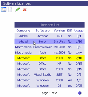
A sample page is shown in the image to the right:
Under the page title you can see 4 standard icons (which are common in most screens), and a list
of items (in this case - Licenses).
The icons presented perform the following functionality:
(Described from left to right)
 Show a list of items in the current page
A list of items with initial data will be displayed. Number of items in the list is limited by the user's 'display' setting. The list allows performing different actions over each item, if you click an item it will display expanded information for that item. Selecting an item from the list will allow to perform other operations like edit and delete.
 Add a new item
This will present a dialog which will allow addition of new items to the list. (No item needs to be selected from the list to perform this action).
 Edit current item
Will present edit dialog for the item currently chosen in the list.
This means you have to first choose an item by clicking on the list, and then click the 'edit' button to edit that item. If no item is selected you will get an error message requesting that you select one.
 Delete current item
Will delete the items currently chosen in the list. (Delete will be confirmed first). Similar to 'edit' action - an item must be selected first from the list.- Get Help for this screen
A fifth icon (not shown in the image) is placed on the far right side of the toolbar, and will give help for the current page; you can use it to access the help page related to the current location.
 All Icons have 'tool tips' associated with them, your browser should show the tool-tip
after hovering over the icon with the mouse for a second or two.
• The Delete and Edit commands will only work if an item is selected from the list (see below).
• The top toolbar is flexible, in some screens more icons will be displayed - to present more functionality,
and in others some of the basic icons will not appear (mostly because they are not needed, or intentionally not
supported).
- Using the item list
- The items list is a standard way to display a list of objects, be they Computers, Software
or Licenses. The list has the following properties:
- Column names are used for sorting data. Clicking a column once will sort by that column ascending,
clicking it a second time (when already sorting by that column), will reverse sort order.
- When hovering with the mouse over a list item, the item's row will change color. (Shown in
the image as darker shade of blue.)
- When clicking a row, that row will become selected, it's color will change to indicate this
state, and more detailed information about this item will be displayed on the right side of the
list. (Row is painted yellow in the image, additional data is not shown in this image).
- Once a row is clicked, the Edit/Delete buttons can be used for that row.
- You can cancel row selection by either clicking another row, or clicking the same row again.
- The list will only display a pre-defined amount of items. (This number is configurable per each user).
For that reason the list displayed is paged, displaying a limited list of items at one time. At the bottom
of the list you can see which page you're on, and also navigate the pages using the arrows on the bottom.
Depending on which page you are on, you may see form zero to 3 navigation icons displayed for each direction
(back and forward). These allow you to quickly navigate large lists by providing the following functionality:
back/forward one page, first/last page, and middle points between current page and first/last page.
 Inventory has a unified user interface. This means we're using common conventions everywhere in
the program. This page aims to introduce you to these conventions:
 Using the left menu bar described above, you can reach different screens that
allow for control over different components in Inventory. Once you've navigated to a specific page you will be presented with a Top Toolbar which allows control over the functionality of the current page.
 Show a list of items in the current page
 Add a new item
 Edit current item
 Delete current item
 All Icons have 'tool tips' associated with them, your browser should show the tool-tip
after hovering over the icon with the mouse for a second or two.